Pages

Saturday, October 30, 2010

The Best Idea That Isn't Mine

In all seriousness, I am really glad that on Thursday, Pandora told me I had used up all my free listening hours this month. If it wasn't for that, I wouldn't have gone to Yahoo Music and started playing random music videos as background noise for working, and I wouldn't have seen Taylor Swift's "Mine" video.

I had talked to Mom Hyena about doing some kind of slide show, of the aww-here-we-are-growing-up-and-yay-we-found-each-other variety, and I didn't want it to be something we had to force people to sit through. I thought it would be convenient to just play one before the ceremony on loop, so if people want to watch they can.

But I like the idea in this video sooooo much more than just a regular slide show! Press play. The photograph idea is thrown in several places throughout the video.


Pretty, huh? To me it just looks like string and photographs, but I love the way they swirl in the wind. I might have to figure out a way to incorporate photos that way instead. Maybe for outdoor portraits? There's a pretty wooded area right outside the church that I imagine we'll use for pictures, and it would be pretty to have photographs blowing in the breeze ...

Have you found inspiration in any unusual places?

Thursday, October 28, 2010

My Ring's Moment in the Spotlight

I can't believe I haven't posted any pictures of my engagement ring up to this point! We've already been engaged for like, forever!

I wanted to post pictures way sooner, I promise. The problem was that the majority of the pictures I had of my ring were blurry, and the pics that weren't had my hand in them. (We got engaged in the winter, and that's when I get Elephant Hands — yes, that's a technical term. As soon as Mom Hyena saw the pictures of my ring on my finger she told me, "You have GOT to do something about your hands!" So I wasn't too keen on putting those out there.)

Now that my ring has had it's own little photo shoot, I can show her off for the Web to see! :) Please indulge me!


Back in October, Mr. Hyena and I went shopping for wedding rings. Since the basket on my ring sits a little wider than most rings, a regular straight wedding band wasn't going to lay flush to the rest of the ring, and I knew Mr. H knew that would bother me in the long run. (What can I say? I'm indecisive sometimes and he knows me better.) The only other options were to saw off (!!!) part of the basket so a straight ring would fit underneath it, or get a band that curves to match it. I love the basket and I didn't want them mangling it, so curved ring it is! My ring wasn't part of a set, but luckily the ring designer had something that would fit it. I'm so glad the jeweler sent this picture over; when we went in to purchase it, they only had a printout of the picture, which made me nervous. I have been so afraid the past couple days that I wouldn't love it when it comes in. But now that I have a larger, clearer picture, I think it will look beautiful alongside my precious. Now I just have to wait impatiently until it comes in!


via Natalie K, courtesy of David Gardner's Jewelers

Does anyone else get Elephant Hands? How do you avoid it?!

Tuesday, October 26, 2010

Room to Dance

It had been quite a while since I'd gone to visit our venue, Downtown 202, and Mom Hyena recently freaked me out by saying she didn't think all the tables were going to fit in there. We're only having eight tables with no assigned or reserved seating so as to make it feel like a mix-n-mingle cocktail-type party, since Downtown 202 only provides that many tables. Mom Hyena was remembering it much smaller than it actually is, and in doing so, I started thinking it was super small too. Where will the people dance?!

I took the afternoon off to go see it again and play with the layout a bit, and I am SO glad I did! To my relief, everything fits exactly as I had imagined it! Since I didn't have good pictures to show off the first time we talked about the venue, I took some this time so you can get a better idea.

This is what people will see when they first walk through the door. In the back there's a stage. We think this may have been an old refurbished firehouse or something. I love the rustic brick! It continues to the left, but hold your horses, we're getting there!


Look up: there are GORGEOUS chandeliers all over the place! All of them are different too.


Now we'll take a look to the right ... there's the bar! Bathrooms are in the back. There's also a little soundbooth area closeted off to the very right, not pictured, but that's where we're going to run the music.


Now let's have a looksee to the left. Hi Mr. Hyena! Hi Planning Buddy JackieDe! They helped. (Actually, I wandered around and told JackieDe where everything was going to go while Mr. H did all the work. Thanks Mr. H!) You can get a nice view of some of the chandeliers here too. Just picture how gorgeous it will look with all the chandeliers going, some nice crisp linens on all the tables, some bright pink pops of color ... *sigh* I love it so much!


Walking into the room where Mr. H was setting tables in place ... I could see that everything will fit just fine over here, so the big room will be open for mingling and dancing. Downtown 202 provides a lot more chairs than tables, so those can go around the edges of the big room so there will be more places to sit.


What's that to the left? Oh, I'm glad you asked! The doors swing open to a little patio that's covered in plants! We have the option of setting up some cocktail tables out here, but I'm not sure what we're going to do yet. We could leave the doors open the whole time or we could just leave 'em closed and people can go out as they please.


Here's the view from the other end of the building. I'm in the storage closet so you can see how big it actually is. Why was I worried about it all fitting?


The chairs aren't super gorg, but upgrading is not an option. These come with the venue, and I don't have the funds for something that will essentially spend the evening getting acquainted with your butt.


So my oh-so-selfish question is going to be ... should I do something to make the chairs a little prettier? Cheap ideas are welcome (ie. not paying for chair covers)!

Monday, October 25, 2010

Shiny! Part 2!

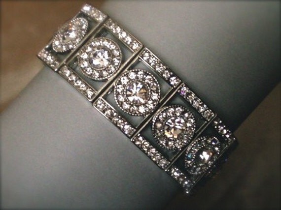
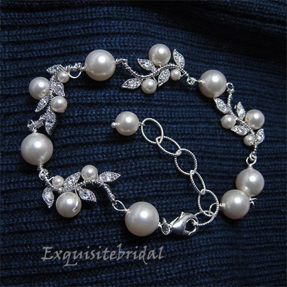
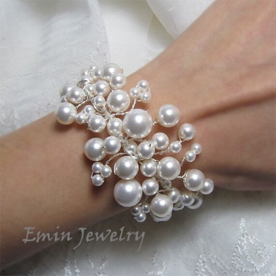
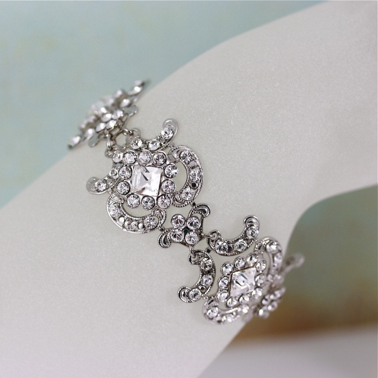
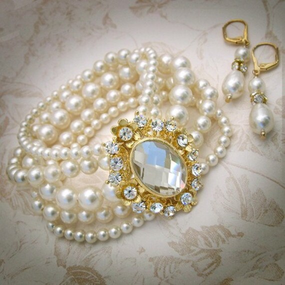
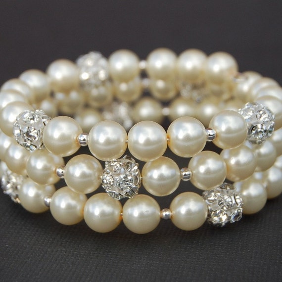
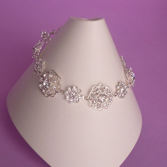
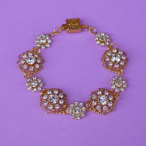
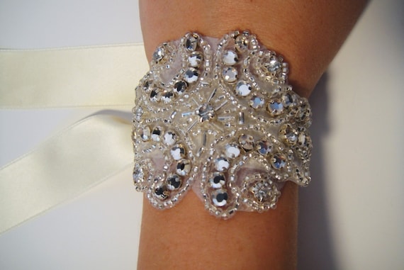
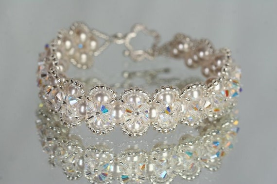
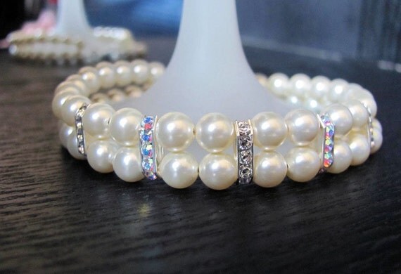
So. We've talked earrings. Now it's time to think about bracelets! I'll stop talking and just get on to the pictures. Remember to wipe the slobber off your keyboard when you're done!

via DUTCHPEARL's Etsy shop

via lolasJewelry Etsy shop

via Exquisite Bridal Etsy shop

via eminjewelry Etsy shop

via Lulu Splendor Etsy shop

via TZTUDIO Etsy shop / Direct link

via Ami Designs Etsy shop / Direct link

via Sahara Amaya Etsy shop

via Sahara Amaya Etsy shop / Direct link

via Kirsten Kuehn Etsy shop / Direct link

via Londonxox Etsy shop / Direct link

via dmalia Etsy shop

What's your favorite?

Saturday, October 23, 2010

Invitations: Envelopes May Be Brighter Than They Appear

I ordered our envelopes from EnvelopeMall.com. They sell them in packs of 100 for the lowest prices I've found online. I really like the envelopes we chose.

If you're making your own invites, please please please please get samples before you spend the $18+. They are only $1 apiece, and it is pretty much the only way you can guarantee that you will get the correct colors.

We knew we wanted one of our envelopes to be pink and the other, maroon, but there were a couple of options for each. I ordered samples for the following colors (the following four images are from the EnvelopeMall site):

Stardream Metallic "Mars"

Astrobright "Pulsar Pink"

Carnival "Red"

Eames Furniture "India Pink"

Kids, this is why you order samples:


That color on the far left? Yeahh, that pretty and light "Pulsar Pink" is NEON. It doesn't look that way on the Web site! (The others, from left to right: Red, India Pink, Mars. India Pink is a tad brighter than the picture looks, but it's pretty close.) Mars was the only one that looked exactly the way I thought it would.

If you don't know approximately what size envelope you want, you can order different sample sizes, which is probably a better way than I did it. I looked up the dimensions for envelope sizes and got out my ruler and drew a bunch of envelope-sized boxes on a single piece of paper. Way to be confusing, self.

I ordered 100 of the 4-bar size in India Pink for the RSVP envelopes (NOTE: THIS IS THE SMALLEST ENVELOPE SIZE YOU CAN MAIL THROUGH USPS! Don't try to mail anything smaller than 3.5 inches by 5 inches!) and 200 of the A7 size in Mars for the outer. Since we're putting together about 93 invitations, this gave me a little room for error, and now I have matching envelopes for thank-you cards too, once I design them.

Once you've got the envelope size and color chosen, you can use this handy dandy chart to figure out what dimensions you need to make your invitations so they'll fit in the envelopes. Maybe make them a tad smaller if you're going to have several enclosures. Ours have a couple o' pieces to them, but they fit just fine, even with an envelope liner.

I don't have a good question to put about envelopes, sooo ... talk amongst yourselves. :)

Thursday, October 21, 2010

Invitations: Font Failure

Our invitations are in!!! And I'll do a little sneak peek soon ('cause I can't keep 'em secret for long!), but first I want to give a little insight into the design process, starting with the fonts.

I'm that girl who can look at a font on a sign and tell you what it is. But I took the lazy way out on our invitations. And I couldn't be happier!

Oh, imagine the horror: all the fonts in our invitation suite ... were already standard on my computer!

Let's put it this way: I could have spent hours upon hours browsing dafont.com or Fonts for Peas or 1000 Free Fonts. To be honest, that probably would have been fun, but I just didn't have the energy. I work in marketing, and most of the time, the standard fonts work fine for any project (Myriad Pro is EVERYWHERE, ya'll!). At my last job, my computer had 11,000 fonts on it, and I never had the time or energy to search through even HALF of those. Even with all those choices, we used the same five for almost every project. As much as I love fonts, I can't bring myself to go searching for them.

Regardless, I am very pleased with the way the invitations turned out. THRILLED, actually!

The fonts we used are:

If you're doing your own design work and don't have the time or patience to look online for fonts, there are a couple tricks you can do with your fonts in Photoshop to make them look cool.

First of all, play with variations on text. Just bolding, italicizing, condensing your font of choice can make it look totally different.

Second is the Swash tool, which I recently discovered! This works best with fonts that have "Pro" in the name.


In your character palette, click the drop-down menu on the far right (next to those double arrows that look like a fast-forward button).


Scroll down to OpenType, and select "Swash."


Now your text is fancy-fied!

This is just a subtle thing you can do to make your fonts look more unique. There are endless things you can do with fonts, even standard ones!

Are you designing your own invites? Do you have any cool text tricks?

(All fonts I've used are standard in Adobe Creative Suite 4, on a MacBook Pro running OSX Snow Leopard. I have no idea what fonts come standard on any other OS or version of Creative Suite.)

Tuesday, October 19, 2010

Joy

I've decided that I no longer need photographs that look straight out of a magazine. (That is the dream, right?) Pictures aren't beautiful because of the aesthetics. They're beautiful because of this:


Pure joy. Absolute ecstasy.

Thanks, APW, for keeping it all in perspective.

Do you have any images saved that make your heart smile? You should share. :)